ShopDreamUp AI ArtDreamUp
Deviation Actions


Description
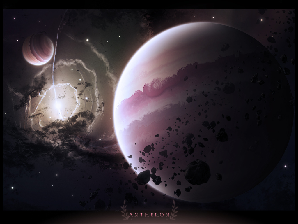
quick sketch and gas giant practice. needed a break from my other major projects ") also, my first wallpaper pack.
also, my first wallpaper pack.
Wallpaper pack:
5:4
1280x1024
4:3
1024x768
1280x960
1600x1200
16:9
1280x720
1440x810
1600x900
1920x1080
16:10
1680x1050
1920x1200
Wallpaper pack:
5:4
1280x1024
4:3
1024x768
1280x960
1600x1200
16:9
1280x720
1440x810
1600x900
1920x1080
16:10
1680x1050
1920x1200
© 2010 - 2024 DemosthenesVoice
Comments39
Join the community to add your comment. Already a deviant? Log In
Nice, it's a good quality space art with some nice gas giants! What I like the most is the nebulae on the left, it has a nice depth and lighting!
Now there are a few things that bother me about the composition of your piece even though it's pretty good.
The planet in my opinion is a bit too big and takes up too much space. That feeling of a space with no end is taken away as space is just in the background and doesn't take much room on the picture at all. I would suggest you make the gas giant a bit smaller and not directly in the center (even though it's a bit to the right) so it's better positioned. Also the texture is nice on the planet, but where the light hits, it feels too soft. Maybe overlay the texture on itself to make it come out stronger? If that doesn't work, try sharpening it or changing the color of white glow inside. A bit more pink-ish or orange.
Now I really love the nebulae as I mentioned earlier, but that extra dust texture that you added, in my opinion, it makes the overall piece feel "overcrowded" especially since there's already an asteroid belt in the foreground. Maybe you should make it smaller and put it a bit lower so we can focus more on the nebulae?
Speaking of the asteroid belt, I just noticed that you can't really tell what it orbits. It doesn't seem to orbit the gas giant, but there's also no planet in the foreground. So it's just there?
All in all it's a really good piece, especially with the nebulae, but the whole thing is overcrowded. Try taking away a few things, especially the dust layer because it looks just like a cloud texture that has been inverted, and also make your gas giants more sharp.
Good job though! <img src="e.deviantart.net/emoticons/w/w…" width="15" height="15" alt="